Wednesday, October 9, 2013

fall + nyc = wedding perfection

As their 2 year anniversary approaches, we wanted to share some photos from this NYC wedding we designed for back in 2011. Our bride and groom, Jennifer & Fred, had a beautiful look with dark antique gold, espresso and a pop of deep red colors. Their look started with letterpress invitations enclosed in a pull out folder. To help their guests out, a map of the NYC neighborhood was included to show where their hotel, church and venue were located...which were St. Patrick's Cathedral and The Russian Tea Room (you can't get much more New York then that!).

To complete their look on the day of, we created die-cut booklet style programs, table name cards, menus, favor tags, and escort cards designed and die-cut to resemble MTA subway cards.

photography by Christian Oth Studio

Monday, September 9, 2013

we're green with envy

...over this beautiful look and color scheme that we created for our bride and groom, Ali & Sean for their March wedding earlier this year. We always love a black & white color scheme when a splash of color is popped in! They decided on this fabulous shade of green to accent their damask design. Their invites were double mounted with a ribbon embellishment and thermography printing.  They completed their look with all their detailed stationery items...from bi-fold ceremony programs, tented escorts, table numbers, "Mr." and "Mrs." chair signs, all the way to stickers for their hotel welcome bags that completed their look.


Thursday, September 5, 2013

circle circle dot dot...

Two year ago, we had the pleasure of working with Taissa & Jeffrey on their wedding invites and stationery in their beautiful blue and antique gold colors. We're so proud to show off their die-cut open pocket (the inserts are tucked in to the pocket on the back of the invites...what a great package!). For the day of, along with their seating board, favor tags, drink signs, table numbers and itineraries for the hotel bags...we designed these eye catching die cut circle programs which were tied to the backs for the guest's chairs at their outdoor May ceremony.

photography by Images by Berit

Thursday, April 11, 2013

a romantic fall wedding

Last year we had the pleasure of meeting with our bride Leisa for her October wedding...she definitely turned into one of our favs! With her burgundy and gold color scheme we designed open pocket folder invitations and a TON of day of stationery for the big day.

photography by Classic Video & Photography

advance token to the nearest party

We had a blast designing for this Monopoly themed April 2012 Bar Mitzvah...ZACHOPOLY! Their invites set the playful tone for a night full of games and celebration. They were mounted invites, enclosed in a box with a pair of dice...you can't get any cooler then that! We continued the look with their escort cards, menus, table names, favor tags...even pillows and a runner! No doubt the amazing event was planned by Tina of Oh So Fabulous.

photography by Caryn Leigh Photography

classic black and cream...with a floral twist

We absolutely loved working on designing the look for our bride and groom, Lauren and Frankie's November 3, 2012 wedding. We created their mounted square invitations and day of stationery to complete their look. They had a timeless elegant color scheme of black and cream with a floral accent (loved their flowers!)...SIMPLY STUNNING. Take a peek at some of their pieces!


Thursday, March 28, 2013

as seen on tv

We don't just love designing for weddings...we love designing for kid events too! Check out the photos of some designs we did for Tina of Oh So Fab for a lifestyle segment for Philly's ABC Action News 6 hosted by Alicia Vitarelli. We designed for 2 kid's theme events...a girl's 1950's sock-hop theme and boy's camping theme...they are just TOO FUN!


a fab south beach wedding look

We always love when Tina, from Oh So Fabulous, contacts us to design stationery for a magazine spread sample...this one was for (201) Bride's Winter 2012 issue. The lime, aqua, white color scheme definitely screamed SOBE...and of course TONS of bling! (Check out the invite w/ sequins ribbon banding!)


photography by dMdC photography

navy & yellow..classic color combo

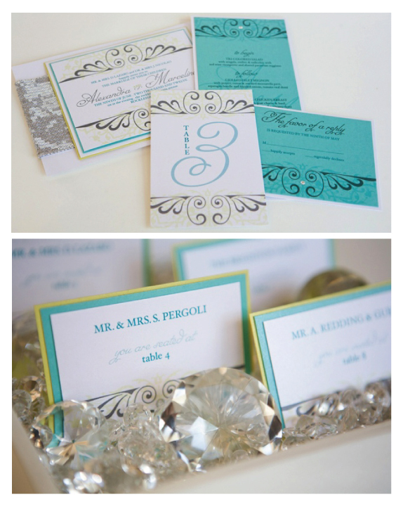
Way back in 2011 we met with our bride Katie for her June 2012 wedding invitations and stationery. She wanted a traditional and classic feel with a clean design. Once we heard her colors, we couldn't wait to get started...we always love a pop of yellow! We designed her invites w/ a simple monogram, they were mounted with a ribbon embellishment. During the process, her mom contacted us for bridal shower invites with a coordinating design, so fun.

Along with her invites, we also designed her day of stationery to complete the look. These items included flat card programs, escort cards that she held in wine corks, tented table names and cards to explain the wine box tradition (a romantic time capsule that the bride and groom will open on their 20th anniversary...such a cute idea!)

photography by Creative Image Collections