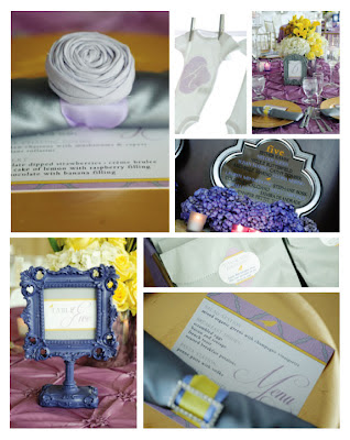
photography by Amy Hand Photography
Friday, September 28, 2012
stylish shower for a stylish mommy-to-be
One of our favorite event planners, Tina from Oh So Fabulous, came to us last year to design invites for her best friend's baby shower. With the colors grey, yellow, lavender and a touch of gold...how could we say no! The look was modern city...with a touch of shabby chic...we were in love. We designed the invites with a pattern that was carried out throughout the day of stationery as well. The invites were also embellished with small rosettes to finish them off. For the day of items, we designed menus, table numbers, favor stickers and the onesies that spelled our the baby's name! So cute
hottness in puerto rico
Way back in 2009 we met with our bride and groom, Monique & Mike, for the first time and hit it off! We just loved their look for their wedding in Puerto Rico...which was fun, modern and anything but traditional.
We started off designing their save the dates that had a bold hot pink ombre feel to it, but yet a touch of elegance with their script font and swirl design. It definitely set the tone for their big day! Next, their invites were a sleek pull out style invitation with a hot pink Swavorski embellishment for that touch of bling (we can never get enough of that!). Then the fun of the day of stationery...our favorite were the circle menus! Take a peek at some of the photos the lovely bride and groom sent over of our work.
We started off designing their save the dates that had a bold hot pink ombre feel to it, but yet a touch of elegance with their script font and swirl design. It definitely set the tone for their big day! Next, their invites were a sleek pull out style invitation with a hot pink Swavorski embellishment for that touch of bling (we can never get enough of that!). Then the fun of the day of stationery...our favorite were the circle menus! Take a peek at some of the photos the lovely bride and groom sent over of our work.
a beautiful spring florida wedding
What better way to brighten up a fall day then to look back to a Spring wedding we designed for last year. We loved Erin & Erik's April 2011 wedding look and color scheme of pink, lavender & silver. Their pocket folder invitation with ribbon closure set the tone of the day...and their look was continued with lots of day of stationery. From booklet style programs (with the unexpected pop of pink inside)...to Mr. & Mrs. chair signs (love those!)...to favor stickers that were on cupcakes (and lots more)...everything coordinated with their look and completed the day! So much so their wedding was featured in The Knot Florida magazine! Take a look at some of the BEAUTIFUL photos from the day of...
photography by Lara Rios Photography
wedding planning by Zoe Gallina
Subscribe to:
Comments (Atom)


